In a previous post we described how to enable and access the JMeter Dashboard Report. It is a useful reporting platform for JMeter tests, providing a sophisticated level of detail alongside powerful summary metrics. In this post we will describe some specific use cases for the JMeter Dashboard Report related to running load tests on RedLine13.
Determining Success or Failure of a Test
One of the primary goals of load testing is to experimentally derive or confirm the capacity limits of a system. However, in practice increasing load will often elicit a declining performance curve rather than an abrupt failure of the system. Therefore we often define certain thresholds when exceeded will constitute failure of the system under test. Some examples of these metrics are error rate, maximum response time, and other performance metrics. The JMeter Dashboard Report conveniently provides many of these metrics.
Statistics Summary
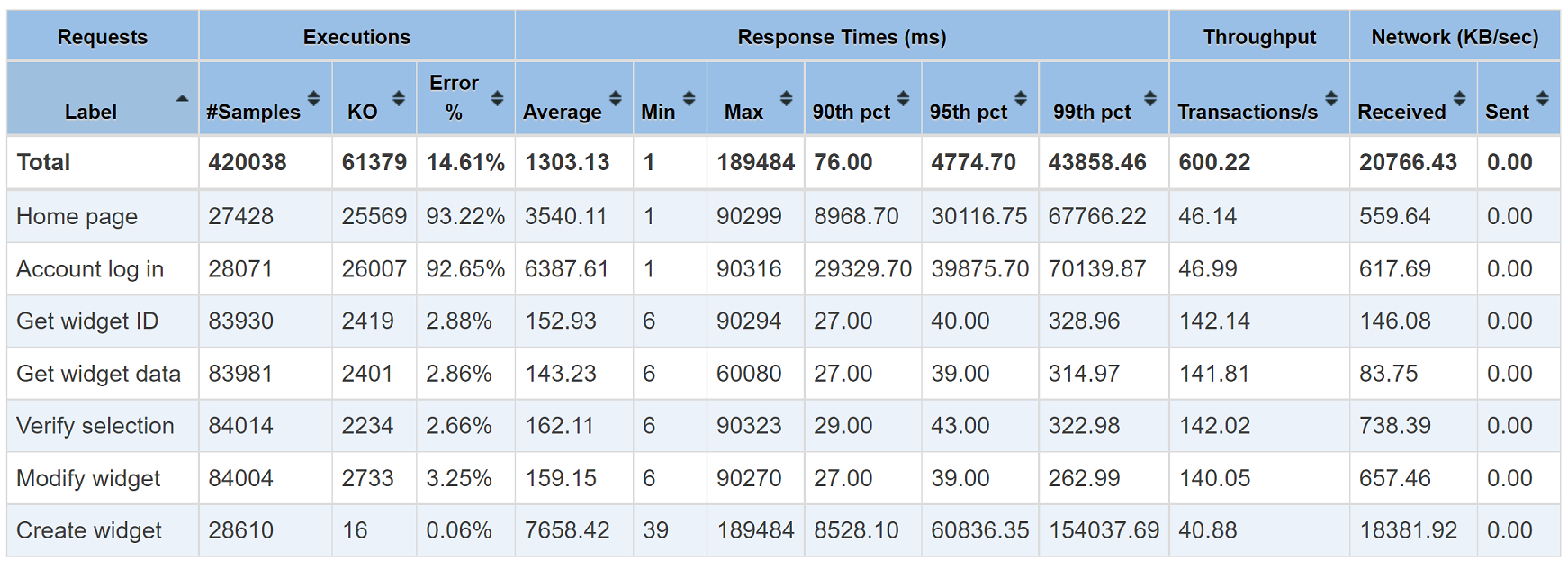
One of the most useful summaries in the JMeter Dashboard Report is the “Statistics” summary. At a glance, it gives a powerful cross-section of your load test. Here is an example:

Under the “Executions” heading, the number of samples versus errors (KO) are calculated and an error percentage is reported. This is done for all requests in the test, as well as for each specific request. You might select an acceptable error percentage (e.g., 0.1% or 0.01% depending on the system being tested) as one of your test’s acceptance criteria.
Under “Response Times”, the overall average response as well as individual request response times are reported in milliseconds. To account for outliers the 90th, 95th, and 99th percentiles are reported in this table. (Further percentiles can be obtained through customizing charts and graphs as discussed below). It is common for tests to have a maximum response defined as one of its acceptance criteria.
The columns under “Throughput” are also useful as they will report how many request transactions were completed in total and for each unique type of request. It may be a goal to achieve a certain throughput for a test scenario.
One important consideration with this table is how the “Total” row tallies metrics for each column. It is in fact calculated in a way which is not intuitive, and we have a separate post on our blog which discusses this.
Error Analysis
Whether you are trying to debug your load test, or looking for the cause of a problem in your target test application, there are countless reasons for analyzing error responses your load test is generating. Often however this necessitates looking through many log files and can be a tedious and time consuming endeavor. Within the JMeter Dashboard Report, there happens to be a convenient classification and grouping of all errors generated during the execution of your load test. Here is an example:

In addition to this classification and grouping, there is another view which clusters the most common errors associated with particular requests. By comparing these views, it can make determining the cause of those errors easier.
JMeter Dashboard Graphs
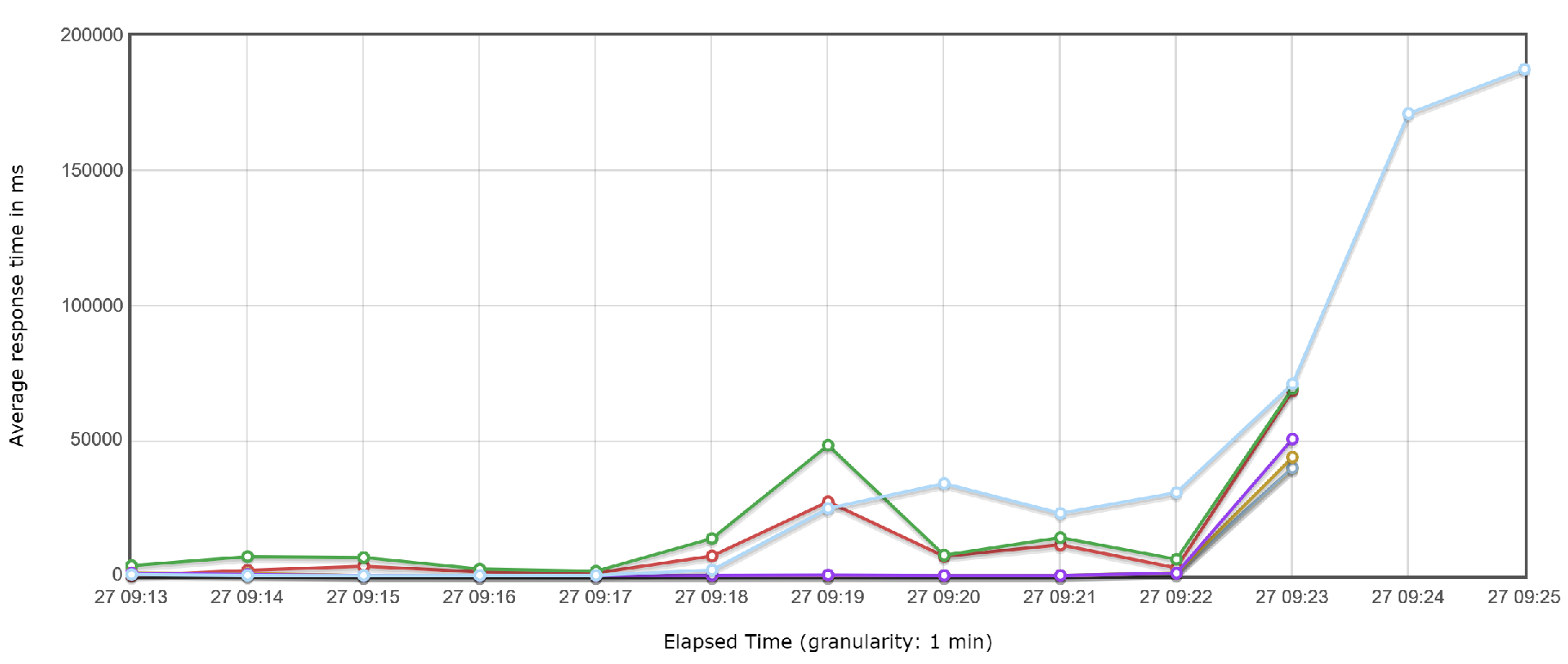
One of the best features of the JMeter Dashboard Report is the multitude of ways output can be displayed in graphical formats. While logs and tables can provide useful information, the ability to visualize results in the form of a chart can make that information easier to comprehend.

These graphs are interactive and can be clicked on and zoomed to show specific timeframes, or the entire test. They can also be exported directly from the JMeter Dashboard Report to be embedded into emails and other documents.
Presenting Test Results to Stakeholders
Another popular use case for the JMeter Dashboard Report especially amongst RedLine13 customers is to share with project stakeholders. The report can be downloaded as a self-contained HTML archive to be easily attached to emails or otherwise shared with interested parties.

The JMeter Dashboard Report can be found under the “Output Files” section of your load test results. For this to be visible you will need to enable saving of output files as described in this post mentioned at the top of this article, which explains how to enable generation of this report.
Complementary Information
The RedLine13 results page will show information about your load test in real time as your test is running. At the conclusion of your test, this information will become static and retained. While we provide detailed information, there are some data points that are captured by the JMeter Dashboard Report and some that are exclusive to the reports presented by RedLine13. Therefore, these datasets provide complementary information.

This is because the JMeter Dashboard Report is generated from resultant JTL files after your test has completed. The information within the JTL output will contain the most detailed and granular information about your load test. However, it will not have visibility to performance metrics about the system, such as the health of load test generators or the estimated AWS cost for your load test. Therefore, the JMeter Dashboard Report – while very detailed – is complementary to other results produced to provide a comprehensive overview of your load test.
Did you know that RedLine13 offers a full-feature free trial? Sign up now and start testing today and try out use cases for the JMeter Dashboard Report.

